In marketing, change is the name of the game. Especially with all this talk of Mobilegeddon lately, there’s never been a better time to refresh your website.
And if you’ve been a reader for a while, you’ve probably noticed some big changes recently here on the Earnworthy site.
Since I’ve been getting quite a few questions and comments regarding my recent site refresh, I figured this would make for a good blog post on the topic.
Let’s take a stroll down memory lane
Before we get to the good stuff, we will need to travel to the past, when Earnworthy was just an idea on a scrap of paper.
When I first launched this site as a blog (and nothing more) on January 13th, 2014, I didn’t really know what direction I wanted to take it in. So I just went with the flow.
Here’s what the site looked like back in those early days, not so long ago:
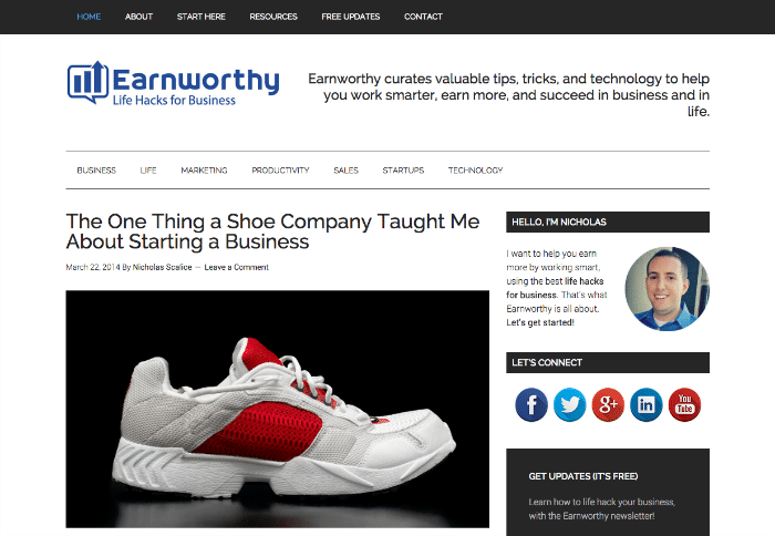
It was simple, clean, and minimalistic for sure. I didn’t even have any significant calls-to-action (CTAs). Isn’t that against a marketing rule somewhere?
Anyway, my focus in the early days was on content, not aesthetics. And forget about mobile. No, literally. I forgot all about it.
While the site was responsive, I hadn’t tested it for mobile devices, nor did I optimize it for mobile traffic. Oh well.
Fast forward to more recent times, and the look of the site changed slightly, but still retained the minimalistic focus.
Here’s a screenshot from just before this recent refresh:
List building, list building, list building
But of course, that couldn’t last forever. I knew Earnworthy should be more than just a blog. I also wanted to capture a higher percentage of email subscriptions directly from the homepage. The old designs just couldn’t do that.
I knew that growing my email list was the number one way to take Earnworthy to a new level, so that was going to be the focus. In addition to that, I wanted to make it easier for first-time visitors to know what the heck Earnworthy was all about anyway.
So, after settling on what I wanted to get out of the new redesign, I put it down on paper and went looking for the best theme to make it happen.
There’s a theme for that
Yes, that’s right. I said theme. Earnworthy is built on WordPress (of course), but it isn’t custom-coded from scratch. Rather, I use the Genesis framework from StudioPress as the basic foundation, and then skin the site with a Genesis child theme.
If that all sounds Greek to you, think of it like this. If this site was a house: WordPress is the foundation where the house is built. Without it, nothing can be built upon it. Therefore the foundation needs to be rock solid. But once it is in place, it sort of gets out of the way, and visitors don’t even notice it.
Then, on top of the foundation (WordPress), Genesis is the actual frame of the house. Genesis also happens to be one of the best frameworks on the market right now. It’s great for search engine optimization, it’ll keep your site running fast, and it’s easy to set up.
But Genesis isn’t really meant to be a theme all on its own. That’s where child themes come in. Think of a Genesis child theme as being the paint, and tile, and artwork on the walls of the house. It’s what makes the house look really nice.
For this refresh, I’m using a child theme called Altitude Pro. It’s fully responsive, and built with the latest standards, so let’s just say it’ll do the job.
I’ve customized it somewhat to give it unique functionality and colors. But not much.
Okay, let’s get back on track with the refresh.
Time to write some copy
After deciding on a child theme and installing it, I had to develop some compelling copy for the new homepage (which would be very different from the old homepage).
I decided to cut the homepage into five sections.
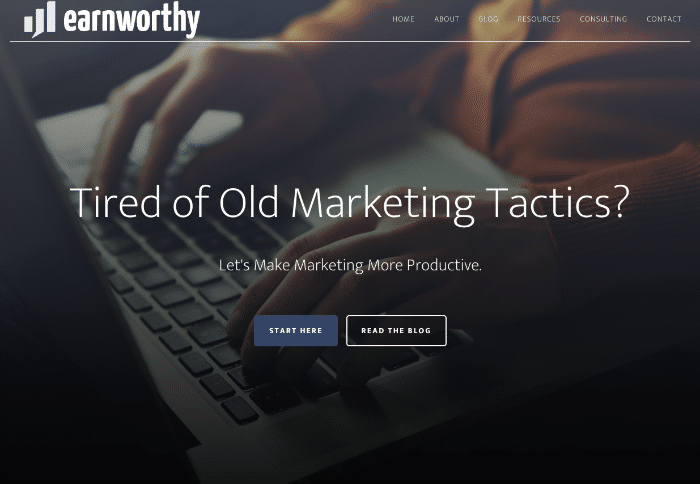
First, there is a large “hero image” which would have the main value proposition of the site, along with two calls-to-action. Visitors can either click on a “Start Here” button to get a full tour of what Earnworthy is all about, or they can go directly to the blog.
Next, there is a more in-depth description, along with some trust logos.
Below this, you’ll find a double opt-in CTA for a free ebook (which is quite a good offer by the way, so check it out if you haven’t already). Had to get that shameless plug in here somewhere!
Then we have the three latest articles from the blog, which will help keep the homepage fresh.
Lastly, there’s a big social media section, where visitors can connect with me on Twitter, Facebook, LinkedIn, etc.
Yes, it might seem like a lot for the homepage, but it’s all about testing. I’m letting it play out for a while to see what the data shows. From that, I’ll make some changes down the road. In marketing, if you’re not testing, you’re not winning.
So, that explains the logic of the new homepage. But what about the rest of the site?
I’m glad you asked!
The anatomy of a blog post
Let’s look at a typical single post and what’s going on behind the scenes.
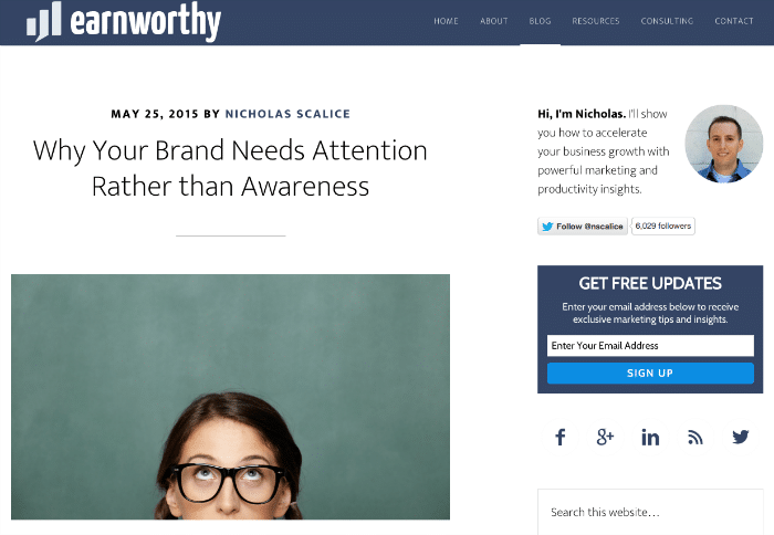
For starters, there are two new calls-to-action on every individual post page. There is a sidebar CTA and a after entry CTA, both focused on getting email subscribers.
These are created using OptinMonster, which is an awesome product that I can’t recommend any higher. OptinMonster is also powering the popover boxes that you’ll occasionally see.
A quick note on popovers: You might hate them, but they sure do convert well. If you’re looking to get more leads, or sales, you absolutely should give them a try. With something like OptinMonster you can even set the popover to only show once every 30 days for each user, and you can also make it fire only when the visitor is about the leave the page.
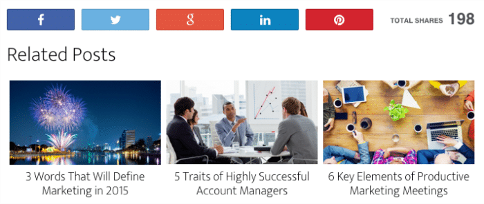
Next, there’s a social sharing widget and a related posts widget mixed in below the post content. For the social sharing functionality, I’m using a plugin called Social Warfare. And for the related posts, I’m using Related Posts by Taxonomy. Both are working exceptionally well so far.
The comments system is still just the default WordPress solution. I am playing around with the idea of testing Disqus, but I haven’t pulled the trigger on that yet. Probably because comments are not a big part of the site these days.
When in doubt, get rid of it
Other than this stuff, I tried to strip away everything that wasn’t essential. I no longer show tags on each single post, or the post category. It just didn’t seem necessary, as it wasn’t helping the page convert.
So there is still a minimalistic feel to the site, which is especially helpful as we conclude by talking about mobile.
Mobile matters more
This was the first design of Earnworthy than included a very detailed consideration of the mobile user. I wanted to make sure the mobile experience was as smooth as possible. Using a responsive Genesis child theme such as Altitude Pro made that pretty easy.
Other than a few minor tweaks, the responsive version of the site was ready to go. I just can’t emphasize enough how important it is to make mobile a focal point of your next design project.
Whatcha think?
Well, that pretty much wraps up what has changed on the site. I hope you were able to take some nuggets of information away from this post.
And if there is something still lacking, or something unclear, shoot me a message about it. I’d love to get your thoughts on the refresh. Tell me what you’re working on while you’re at it.

As always, thanks for reading (or skimming, scanning, or whatever you call it).