
Way back in 2009, a whole five years ago, a Morgan Stanley analyst predicted at the Web 2.0 Summit that essentially mobile Internet traffic will surpass desktop traffic by 2014.
Guess what? It’s happening.
In 2012, Internet research firm comScore also predicted that mobile users would surpass desktop users by 2014.
In January of this year, Intelligent Positioning conducted a poll of mobile traffic share, compared to desktop traffic share over the course of 2013. Their results found that mobile and tablet traffic share will overtake desktop in July 2014.
And finally, just a couple of months ago, Google’s Matt Cutts stated that he “wouldn’t be surprised” if mobile search exceeded desktop queries this year.
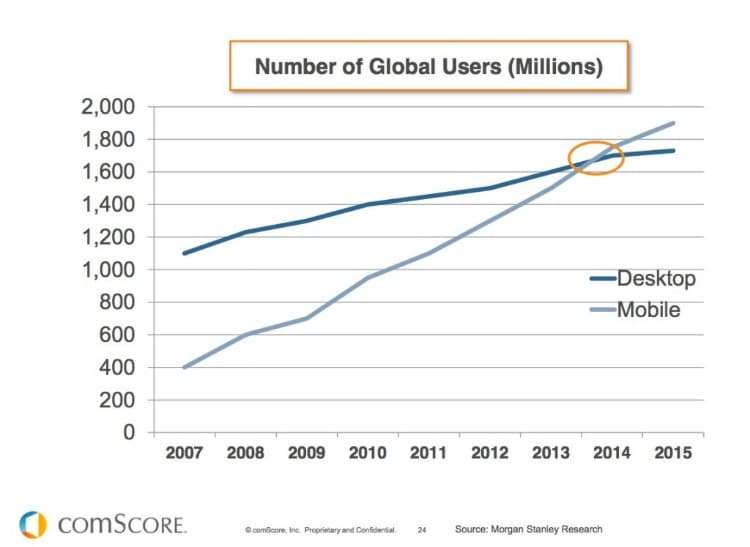
So it appears that next month, July 2014, will be a huge month for the Internet and for data nerds like me. Essentially, it’s going to be the first time in history that more people access the Internet from a mobile device than from a desktop computer. As Joe Biden would say, this is a big f—ing deal!
Why does this matter and how does it affect you and the way you do business?
Well, consider this: Ten years from now, professors will probably be teaching students about the development of the Internet, and 2014 will come up as the inflexion point for how we accessed information back in the “stone ages.”
Furthermore, this knowledge of where our site visitors are coming from changes the way we build websites. Mobile optimization can no longer be an afterthought; it is the now the primary concern of developers.
So if your website is just “mobile friendly,” but not mobile awesome, now is the time to address that issue.
But don’t get too hung up on the terminology. Of course, right now we’re still talking about the “mobile web” as if it were something existing in its own separate universe. This is going to change as well and the lines between how we connect to the Internet become blurred beyond recognition.
Universal compatibility will be what matters. Whether your users are connecting with their phones, tablets, laptops, wearable devices or whatever else, your job is to ensure that a positive user experience is consistently delivered.
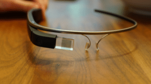
Keep in mind that the wearable tech revolution has barely begun. Google Glass is nowhere near ready for mainstream development, but it might be ready within 6 to 12 months. And many analysts are predicting that we will see a wearable device from Apple before the end of the year. That again will change the way we access the Internet in a huge way.
How the heck do you optimize a website for Google Glass? Is there even such a thing as “Glass Optimized?” We shall wait and see.
For now, stick to the basics and you’ll be fine. Make sure you’re using the best practices for responsive web design and usability. Test everything on iPads, Android tablets, and all sorts of smartphones.
As a website owner, it’s time to put mobile first, because the consumer already has.
What are your thoughts on the rate of growth of the mobile web versus traditional desktop computing? What about your personal Internet usage? Are you using your mobile devices more or less than last year? I’d love to hear your views, so hit me up on Twitter or post a comment below (and hey, you’ll get extra bonus points if you do it from a mobile device)!